For my story I really wanted to be able to tell my message within the given time frame. I could have gone on and on, but I think the time limit actually helped me keep my story nice and short. Being able to drive home an important message within 2 minutes is a challenge, but since the message itself wasn’t complex it was rather easy. For my design process I was able to ask one of the local highschool football coaches a question about what he sees on a daily basis regarding his athletes. This was the best part of my story because I was able to use someone who sees it happen to kids every year and knows the full extent of my story. I used google docs to write down my script as to what I was going to say during my story. Finding the right parts of the story to tell was difficult because I had to keep it short in order to meet the time requirements. I keep my history in sports short because I felt it wasn’t too important to what the overall theme of the story was. It took me 6-7 takes to record the story without errors. I didn’t think I would get nervous talking into a microphone to nobody, but I struggled with pronouncing my words and my pace. For the first few takes my voice was shaky and I had cottonmouth. After awhile my nerves calmed down and I recorded a draft without errors. What I like about audition over other programs is that you can easily edit the length of the audio with the sliding tool. With other programs such as audacity I struggled with the interface and ended up just getting frustrated. I really enjoyed doing this part of the project as I was able to make sense of all the images I made with photoshop and illustrator.
Month: October 2019
Raw Audio
Audition Tutorial
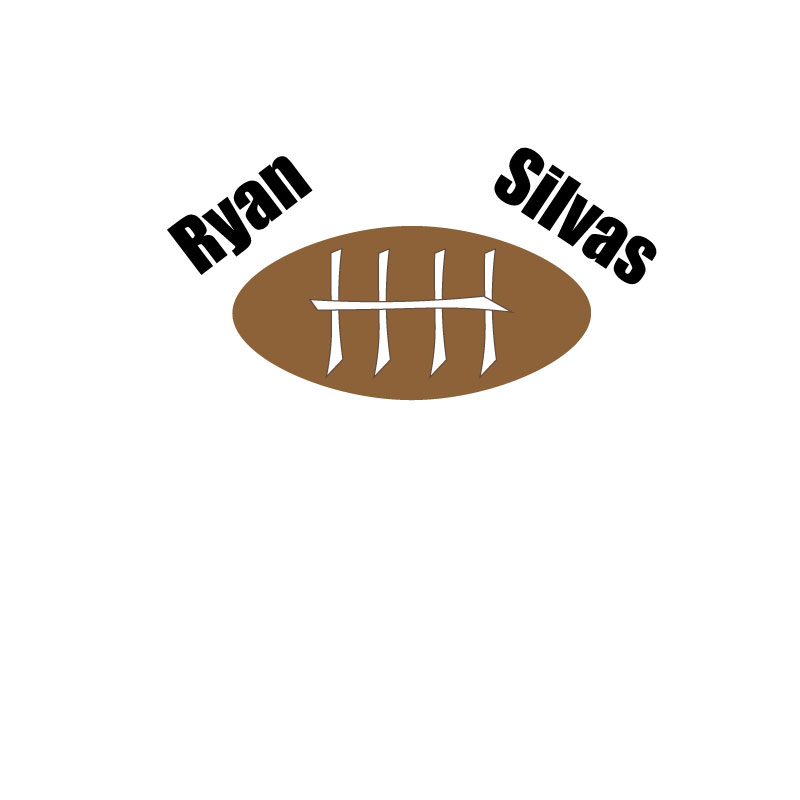
Final Logo Draft

Draft Logo
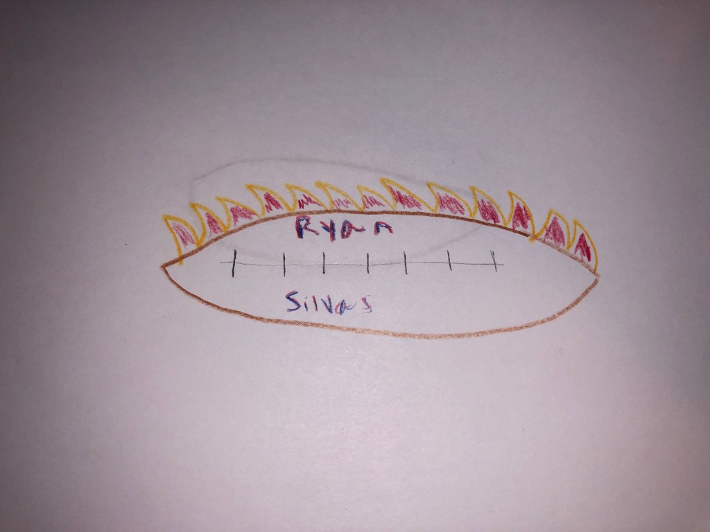
Logo Sketch
I am not the best artist, but this design will contain a football because that is what my story is about. I hope to place unique designs within the football to make it appear more lively.
