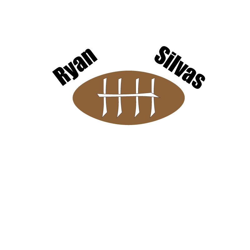
For my project I chose to use a football because that is what my story is about. The design process for this logo was fairly easy because my story only revolves around one major topic which is football. I found a YouTube video that showed me how to make the egg-like shape that represented the football which helped, but I was unable to figure out how to make it appear more 3D. The significance of the football is that it is a major part of my life and always has been since I was seven which is why I chose it to be the topic of my story. Using illustrator has been a challenge for me because I have never been one to connect with drawing or physical art. My creativity is more associated with story telling and video production. Ever since I was little I have struggled with drawing, but when instructed in class I could come up with an interesting story off the top of my head. The story I am telling for this class is a true story so it won’t involve any creative writing which is why it was difficult to design a creative logo. The main element I used when putting together my logo was the shape tool. I was able to use several of the different shapes to help put together the football and also using the curvature tool to help shape the laces. I choose the laces to look slightly off center as I wanted them to look more cartoonish rather than realistic because I preferred that style. I chose to use a large text font because I wanted the name to stick out almost like it was a movie title and it would catch the viewers eye. I enjoyed this project and I am excited to see what my final draft turns out to be as I think the criticism from my classmates will help.