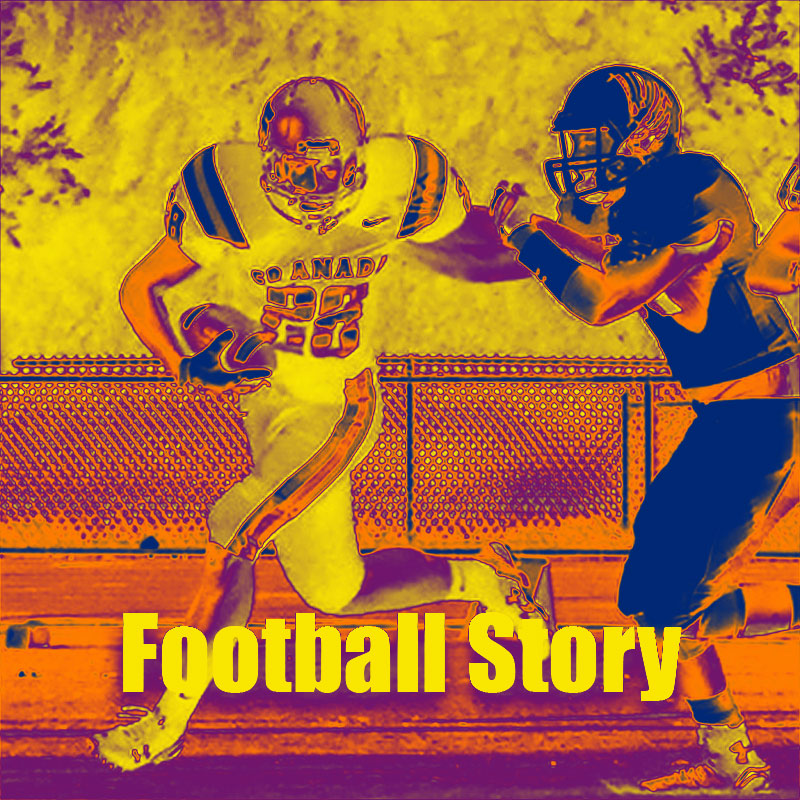
For my project I decided to use a photo that I own that was taken by my mother. This photo is used as a cover image to the story I wish to tell because it is a photo of me. The design photo that inspired me the most was one of the examples you provided. The best one in my opinion was The Legend of Matt, I thought it was very well done and also funny. I used the gradient filter to emphasize the colors that were previously there. The school I attended was yellow and black so I liked how it looked when the yellow was brightened. This project was very difficult for me because I had a hard time finding photos that would relate to my topic without having to spend extra money. I don’t have many photos of myself playing anymore so this was one of the only photos I could find. I really struggled with trying to learn how to crop out parts of the background to replace with another image. My mother used this photo for my college football recruiting profile and gave me permission to use it for my school project.

I’m going to start off with I really like this design. I to struggled with what I would do and how I would find the photos that would go with the design and topic that I had chosen. I like that you have blurred it enough that you can use your imagination as to who is who. It allows you to put yourself inside the story giving it a personal investment as the viewer. As to what I would change, I am going to start with the easy one.
The color of your font, yellow works but it also gets loss in the yellow from the background, maybe go with a different color of yellow? Or maybe use black since it is the other color of your high school. The second thing I would look at changing is clearing out the clutter behind the image, delete the fencings and extend the yellow cloudy backdrop to the ground.
As I stated at the start, great job with the design, I am going to look at ways I may be able to change mine with the same techniques.
LikeLike
Ryan, this style is very unique and interesting. I like the way that you adjusted the gradient scale so severely to create a different look. I could definitely see this graphic being used as a magazine cover, or for a book cover.
One critique that I would suggest would be to make the lettering in the photo a different color. With it being yellow, as well as a lot of the background coloring, it may be difficult for someone to read. I might try adjusting the lettering and verbiage to show black, or even red. A color that makes it stand out more and appear more prominent.
I would also suggest perhaps lowering the gradient level just the slightest bit. I say this only because the faces appear a little distorted due to the way the lighting and coloring are affected, so perhaps just a slight adjustment would clear that up. I think that you have done a great job on this project, and look forward to seeing more! Great work.
LikeLike
For my project I lacked vision and creativity. The hardest part by far was finding photos to fit the theme of my story without having to pay money for them. I wanted to do a great job, but lost motivation due to the lack of inspiration I had. If I would have just settled for some of the photos I had I might have been able to make something decent. As Gary suggested I should have cropped out some of the content in the background to make the image appear more smooth. The color of yellow I chose was slightly too bright and should have been toned down a bit to make it more appealing to the viewer.
LikeLike